Conversion content
Quick solutioning to increase the conversion rate of a lagging payment method in DIY tax software
01 — The product
H&R Block's DIY tax software is a self-guided tax filing tool that walks users through each step of preparing and submitting their taxes.
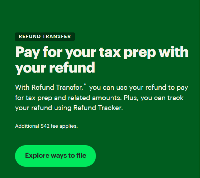
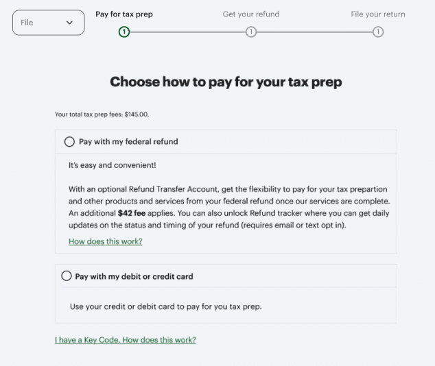
The Refund Transfer payment method lets users deduct the cost of tax prep from their federal refunds instead of paying out of pocket.
02 — The problem
Refund Transfer was underperforming compared to the previous year, with no clear reason why.
We needed to understand the drop in conversions and quickly come up with solutions that could be easily tested and implemented.
Challenges
New to the team, new to the feature
I joined the company 2.5 weeks prior to beginning this work and had neither worked with this team nor on this feature in that time.
Tight timeline and quick turnaround
We were assigned the task on a Tuesday, and we wanted to have multiple solutions designed and ready to test by Friday.
03 — Design process
Discover
Consulted with product about potential reasons for the drop-off and possible solutions.
Familiarized myself with the payment method and its position in the checkout flow.
Define
Created a customer problem statement to guide the process.
Framed the primary content goal as: make the benefit clear, easy to grasp, and obvious at the point of decision.
Design
Wrote in-line tag copy to highlight the core benefit of choosing Refund Transfer.
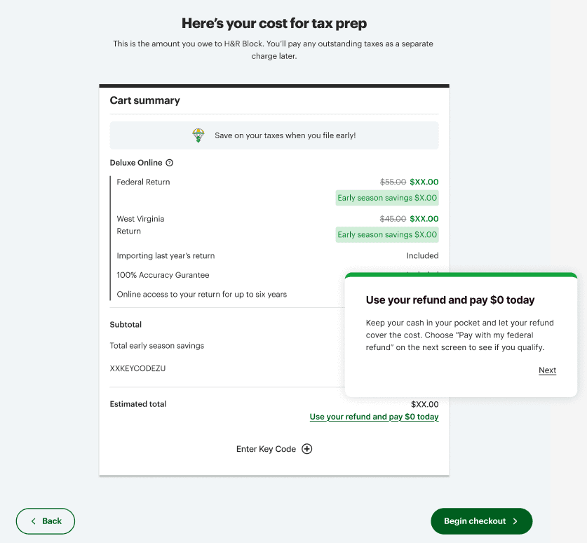
Designed content for a WalkMe popup on the cart summary page directly before checkout.
Refine
Worked with legal and revised copy to ensure compliance.
Reviewed A/B test results to assess the effectiveness of our proposed solutions and to compare content variations.
Discover
First, I met with the product manager and the visual designer in a kickoff meeting to discuss potential causes for the drop-off, business constraints, and quick-turn solutions that might be worth testing.
Next, I immersed myself in the full checkout experience to see where and how Refund Transfer was presented. I took time to:
Navigate the QA environment to view the live flow in context
Consider the user's mindset at that point in the experience
Understand how Refund Transfer fit into the broader journey
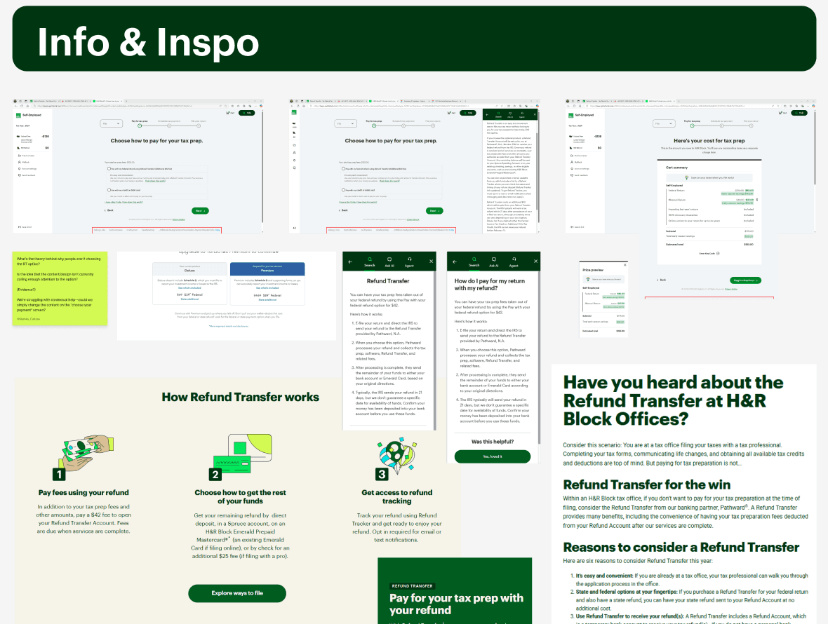
Review the dotcom site to align with existing language and positioning
Define
I took insights from the kickoff meeting and my mini discovery phase and shaped them into a customer problem statement.
Customer problem statements are a key part of my content design process. In this case, articulating the problem from the user’s perspective made it clear that Refund Transfer wasn’t being skipped due to lack of value, but rather because that value wasn’t clearly communicated or easy to recognize at the moment of choice.
Our primary goal, then, would be to make the benefit clear, easy to grasp, and obvious at the point of decision.
Design
Out of all the potential solutions we considered to achieve that goal, we finally settled on two:
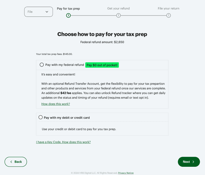
An in-line tag on the payment option screen
A link to a WalkMe popup on the cart summary screen
In-line tag
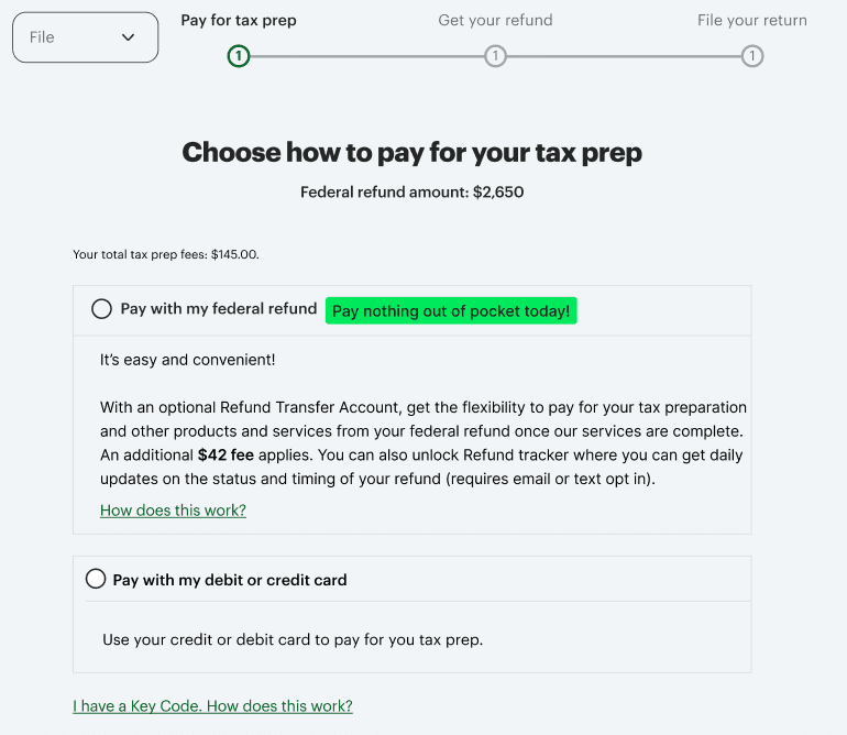
First, we decided to add a bright green tag to the payment screen, in line with the Refund Transfer option. This tag was already part of the design system, making it quick and easy to implement for both design and development.
Our hypothesis was that highlighting Refund Transfer’s main benefit in a concise, eye-catching tag would make the option more visible and easier to understand at a glance. This would allow us to:
Lower cognitive load by reducing the effort required to process information in a high-pressure moment
Deliver key information with clarity and precision, using as few words as possible in a high-visibility space
Guide users toward a faster, more confident choice without overwhelming them with too much text or explanation
(I advocated for rewriting the Refund Transfer description as well, but that was not within our purview at the time.)
For A/B testing the in-line tag solution, we chose two options:
Pay nothing out of pocket today!
$0 due today
I had several considerations in mind while drafting this content and suggesting which options to test. For example:
"$0" vs. "nothing"
What will resonate more with users? "$0" might register more quickly, particularly in the context of payment and pricing. Conversely, a dollar sign here could potentially trigger cost sensitivity.
Length
A shorter tag may be quicker to read and easier to comprehend at a glance, but a longer tag could be more effective in catching the eye.
Exclamation marks!
Exclamation marks can grab attention and indicate excitement, but they should be used sparingly. The very next sentence already ends with one, so adding another could be overkill.
WalkMe popup
For our second solution, we decided to use a WalkMe popup (a third-party guidance element that would launch when users clicked the corresponding link) on the cart summary screen that comes immediately before the payment option screen.
The goal was to draw users in with compelling link text, then introduce the concept of Refund Transfer by leading with its main benefit. Since we were legally required to show this content to all users, we also had to indicate that not everyone would be eligible.
Directing users to do something on a future screen is obviously less than ideal, but this was another quick and easily-implemented option that we thought worth trying.
Refine
Before we could begin A/B testing, we had to ensure the content was legally compliant. Typically, the PM presents the content to legal, gathers feedback, and relays it to the content designer, who then makes changes for the PM to bring back to legal... and so on.
This back-and-forth can make iteration slow and indirect — something we couldn't afford on our tight timeline. To ease the friction, I responded quickly to legal feedback with clarifying questions and rapid revisions, which helped build trust and maintain momentum. After a few small adjustments, we were ready to proceed.
(In a later project with the same PM, I asked to join the legal meetings directly. The PM was happy to include me and give me the floor to walk the team through the content myself. Opening this direct line of communication simplified the process and, in some cases, allowed us to iterate in real time.)
04 — Results
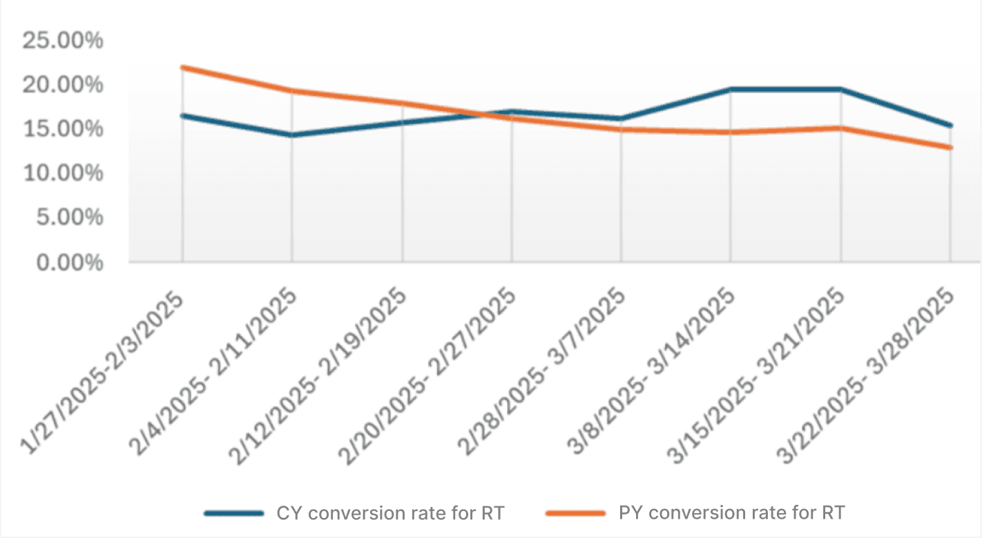
Both versions of the in-line tag screen led to increased conversion rates compared to the control during A/B testing, with the overall winner showing a 6% increase.
The WalkMe link on the cart summary screen had a 10% click rate. Of those who viewed the popup, 34% chose the Refund Transfer option.
After implementing our solutions, we saw not only a reversal of the downward trend, but also a year-over-year increase in users choosing the Refund Transfer payment method.
05 — A few things I learned
Responsiveness is next to godliness
With a tight timeline, a lot of moving pieces, and multiple players, being readily available and responding quickly are crucial to success.
Responsiveness builds momentum, strengthens collaboration, and prevents bottlenecks so the work can keep moving forward.
Be willing to adapt and accommodate
Working with new teammates often means adjusting to unfamiliar rhythms, communication styles, and ways of making decisions.
This project confirmed that flexibility builds trust, and that the best way to work well with others is to stay open, curious, and adaptable.

