Contextual help
Redesigning the expense entry experience for small business owners in DIY tax software

01 — The problem
Small business owners told us that entering expenses in our DIY tax software felt tedious and time-consuming.
Each expense had to be entered one by one across multiple screens, and there was no way to remove categories they didn’t use. This led to frustration, longer task times, and uncertainty about what to include where.
Original screens
Original screens
02 — Design process
Discover
Reviewed the original multi-screen experience and identified key friction points. Partnered with research and product to clarify user needs and pain points.
Define
Established content priorities: reduce friction, support confident decision-making, and avoid overwhelming users in a task-heavy tax environment.
Design
Added concise, plain-language tooltips with links to expanded help articles. Collaborated with design, PM, and tax SMEs to ensure a seamless experience.
Refine
Incorporated feedback from user testing and iterated on wording and formatting to balance simplicity with depth, based on what users found most helpful.
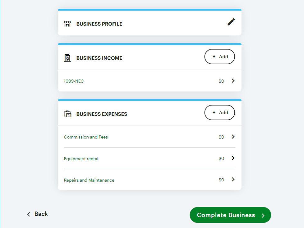
What we improved
We redesigned the experience into a single screen with nested expenses. Users could now quickly and easily enter their simple expenses all on one screen, with the ability to add or remove categories at will.
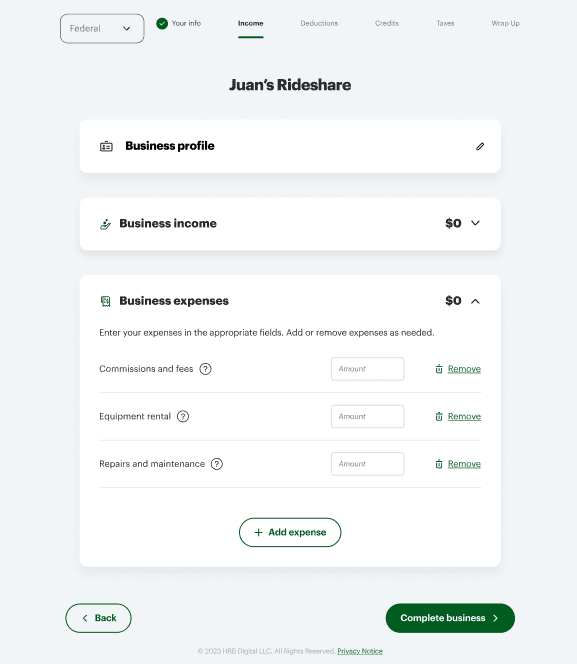
Redesigned business summary screen with nested expense entry
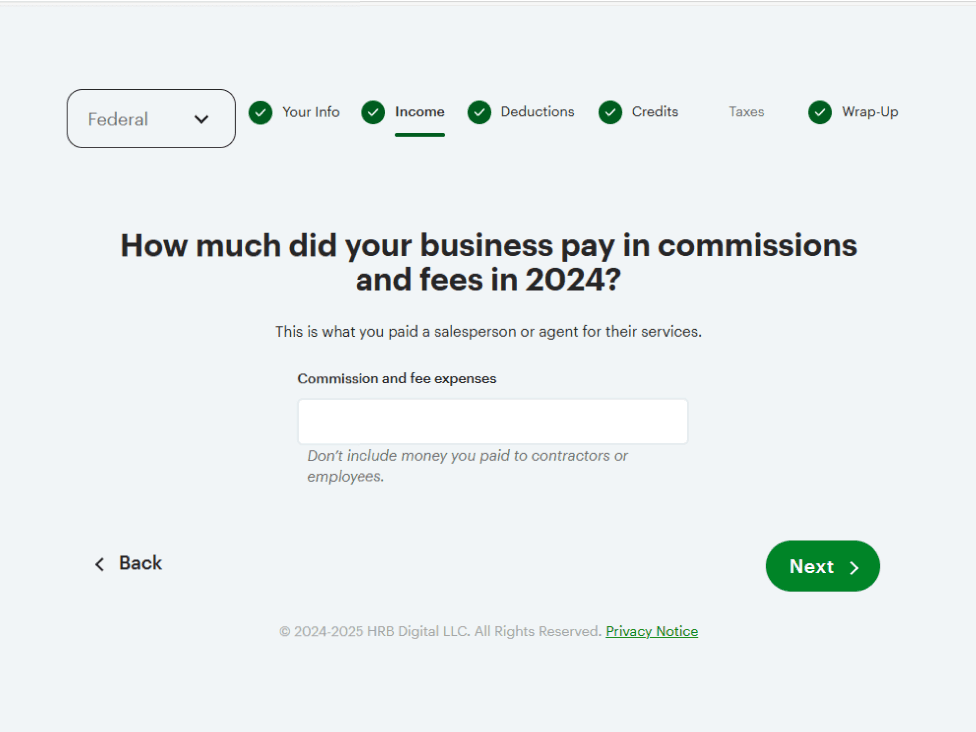
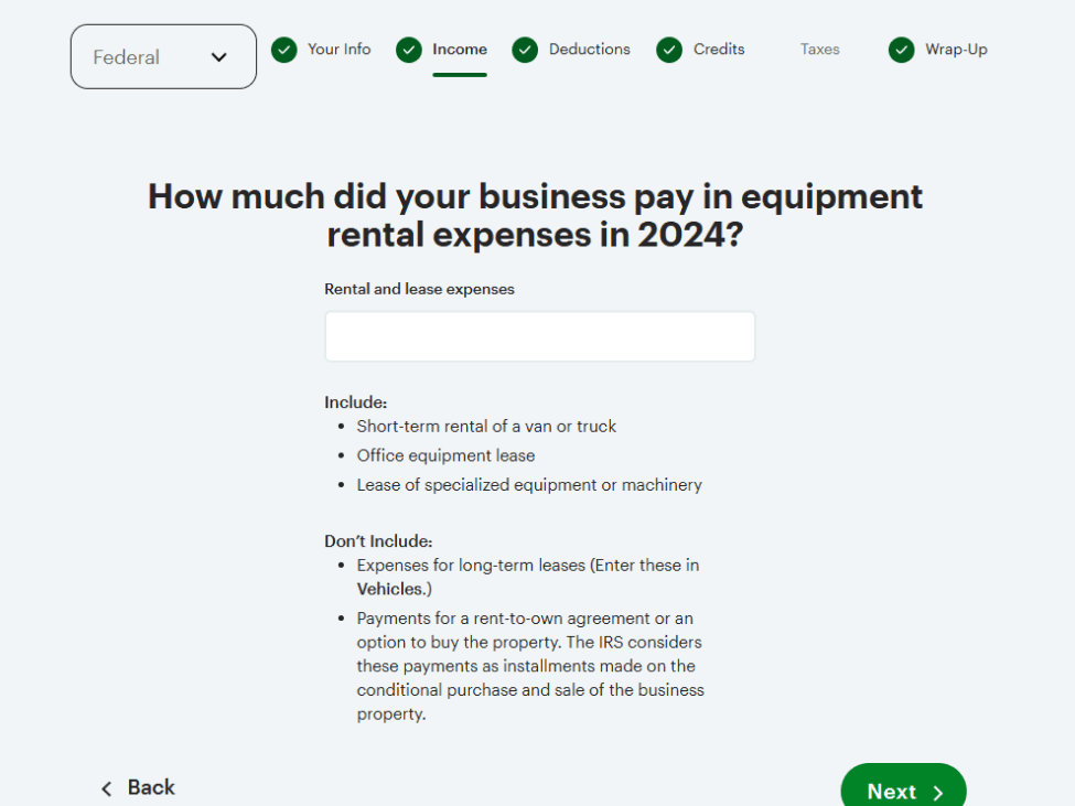
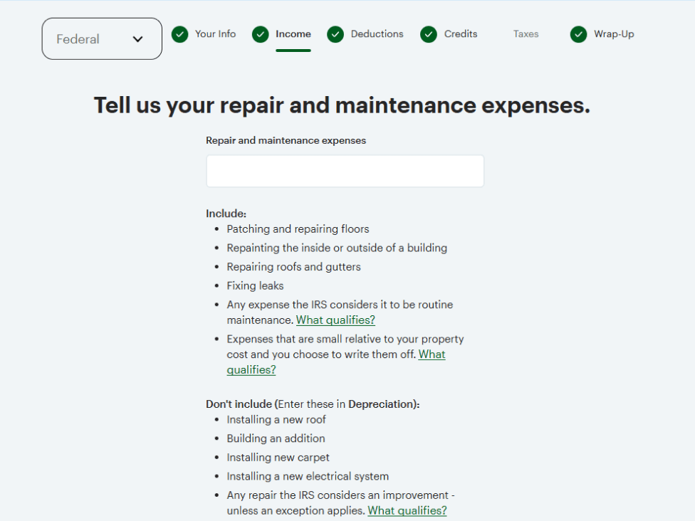
My contribution
I led content design for the flow, creating new tooltips and help articles while iterating on existing content for clarity and consistency.
I advocated for linking full help articles with expanded instructions and examples in the tooltips, based on the hypothesis that users would prefer anchored, always-visible support over hover-based content alone.
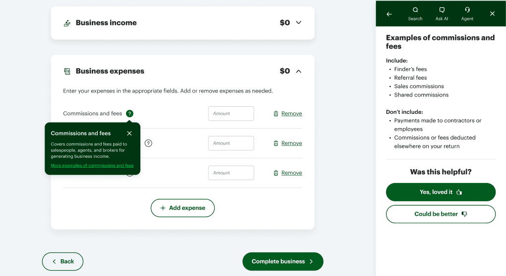
Expense tooltip with more examples in a linked help article
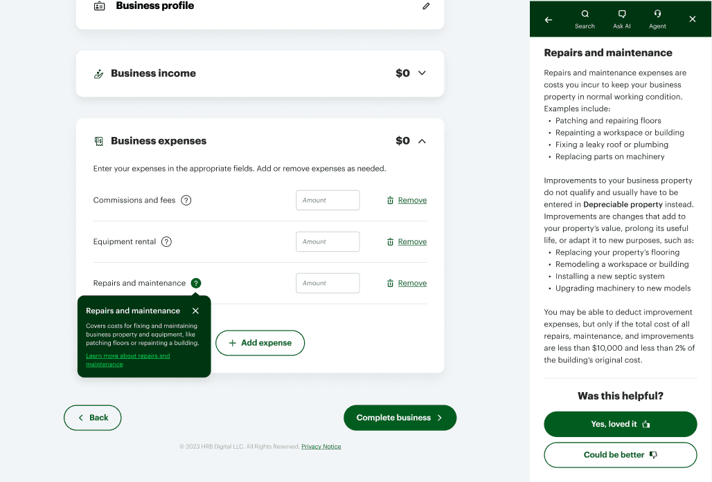
Expense tooltip with expanded instructions in a linked help article
03 — Results
In moderated testing, 85% of users preferred the new experience, with several calling out the embedded content as especially helpful.
They appreciated having just enough information, with more available if needed. The combination of flexibility and guidance helped users complete the task with more efficiency and greater confidence.
“
If I didn't have that information [here], I would have to go out and look for it somewhere else."
— Moderated user testing participant