App tutorial
Redesigning the tutorial for a digital business card mobile app

01 — The problem
KIT’s tutorial was long, text-heavy, and leaned too much on telling rather than showing. Users were left unclear on what the app did or how to use it, and many dropped off before they could even get started.
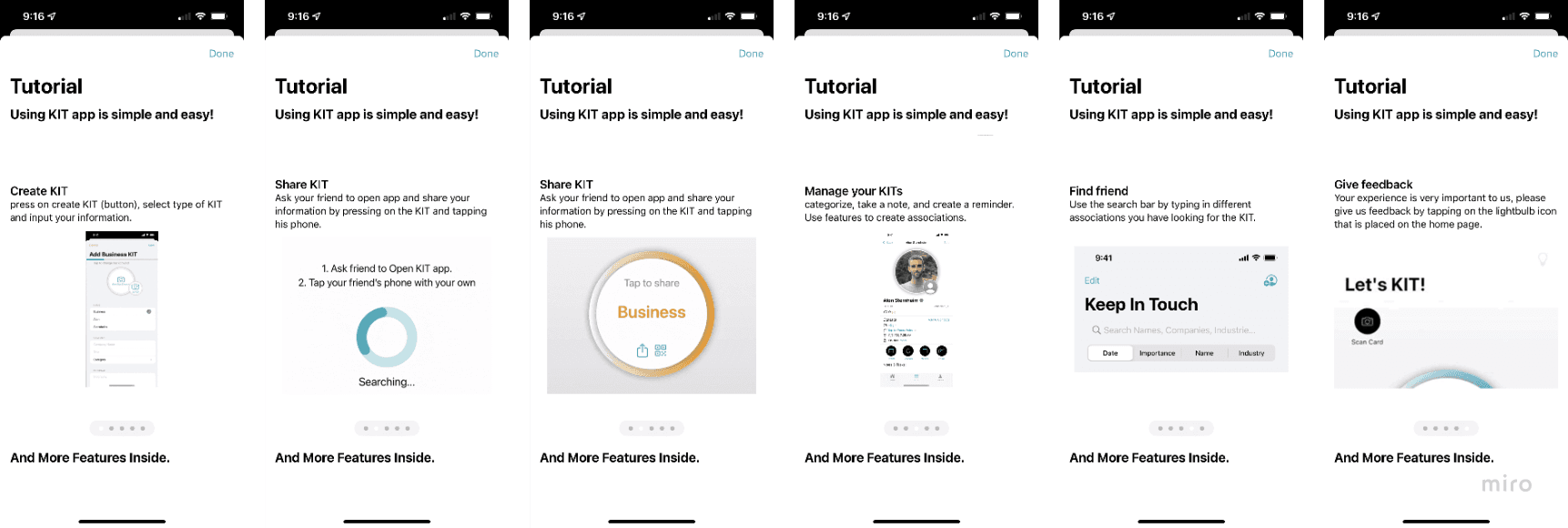
ORIGINAL TUTORIAL
02 — Design process
Discover
Audited the app’s content to pinpoint areas of opportunity
Interviewed the founders to get an understanding of product vision and voice
Define
Identified gaps in onboarding that left users uncertain how to use the app
Prioritized clear guidance on understanding core features
Design
Redesigned the tutorial to focus on key actions and reduce cognitive load
Split content into two paths: an essentials-only version and a full walkthrough
Refine
Conducted user testing and validated comprehension of primary feature and tutorial structure
Provided suggestions for further testing and future iterations
What we improved
We streamlined the tutorial by cutting redundant content and focusing on the app’s core feature: sharing KITs. We turned it into an overlay on the app’s actual screens, making it easier to follow in context.
Users now start with a short, 3-screen overview and can choose to continue to a fuller walkthrough of secondary features. If they skip out early, a friendly modal lets them know where to find the tutorial later.
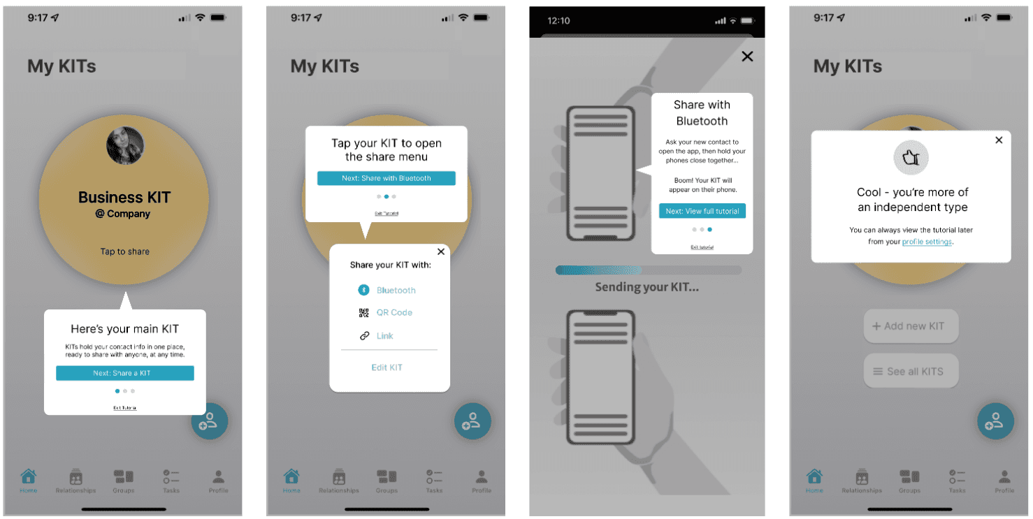
Revised tutorial - condensed version
My contribution
I led the tutorial redesign by auditing existing content, aligning with stakeholders on tone (cool, fun, simple), and restructuring the flow to better highlight the app's core features.
I wrote concise, conversational copy for the new flow and tested it with users to validate improvements and gather feedback for future iterations.
03 — Results
All testing participants found the new tutorial clearer and more intuitive than the original. They understood the app’s core feature and felt more confident about how to get started.
“
If it’s a lot of words, I would skip the tutorial and jump in [...] Fewer words get me to click through it”
— Moderated user testing participant